

Hanging family portraits should feel like bringing warmth into your home, not curating a museum exhibit. Yet so many of us end up with stiff, formal arrangements that make our living spaces feel more like a doctor’s waiting room than a place where memories live and breathe. The difference between a gallery wall that invites you in and one that feels awkwardly formal often comes down to a few simple choices about placement, variety, and authenticity. When you get it right, your family photos become part of the conversation your home is having with everyone who enters.
Start with Eye-Level Placement, Not Corporate Symmetry
The golden rule for hanging portraits is simpler than you might think. The center of your image should sit between 57 to 60 inches from the floor, roughly at average eye level. This measurement creates a natural focal point without demanding attention. What makes arrangements feel stiff is often the impulse to create perfect rows or force symmetry where it doesn’t belong. Your family isn’t a grid, so why should your photos be?
Think about how you actually move through your home. You don’t walk in a straight line, pausing at exact intervals to admire perfectly aligned rectangles. You wander, you pause where something catches your eye, you notice details that draw you closer. Your portrait arrangement should mirror that natural flow. This doesn’t mean chaos, but it does mean allowing for rhythm instead of rigid precision.
When planning your layout, try mapping it out on the floor first. Arrange your frames, move them around, live with the composition for a few hours before committing to nail holes. This simple step saves frustration and lets you see relationships between photos that you might miss when thinking in the abstract. You can also use life-size paper templates on the wall to visualize spacing without permanent marks.
Mix Frames and Sizes to Create Visual Interest
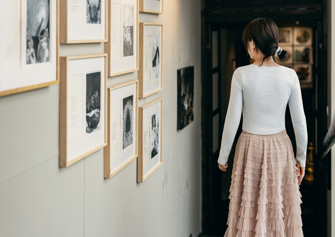
Nothing signals “stiff formal display” quite like identical frames in a perfect row. The irony is that mixing frame styles, sizes, and orientations actually creates a more cohesive feeling because it mirrors how memories themselves accumulate over time. Some moments are bigger than others. Some deserve ornate frames, others look best in simple black wood. Black and white photographs often work particularly well for creating unity across different frame styles, giving you flexibility in presentation while maintaining visual harmony.
The key is finding your unifying thread. Maybe it’s a consistent color palette across all frames. Maybe it’s keeping all your beach vacation photos in weathered wood frames while formal portraits get classic black. Maybe you mix frame finishes but keep all your mats the same neutral tone. The thread doesn’t have to be obvious to work, it just needs to be there, creating subliminal coherence even as individual pieces vary.
Spacing matters as much as the frames themselves. Maintain consistent gaps between frames, generally between 2 to 4 inches, to create breathing room. Too close and everything blurs together. Too far apart and each photo becomes an isolated island. That middle distance lets each image be distinct while still contributing to the larger story.
A house is made of walls and beams; a home is built with love and dreams.
– Ralph Waldo Emerson
Balance Your Wall Space Without Overthinking It
There’s a design principle that your frame arrangement should occupy at least 60% of your wall width. This gives you a target that feels substantial without overwhelming the space. But here’s what matters more than hitting an exact percentage: your arrangement should feel intentional, not like you ran out of photos or courage halfway through.
When hanging portraits above furniture, leave about 6 to 12 inches between the top of your couch or console table and the bottom of your frames. This creates visual connection without making the photos look like they’re sitting directly on the furniture. The gap matters because it establishes relationship while maintaining independence. Your photos enhance the space around them rather than competing with it.
Consider the room’s other elements too. If you have strong vertical lines in your architecture or furniture, a horizontal arrangement of frames can provide pleasing contrast. If your space feels wide and low, a vertical gallery wall can add height. You’re not just hanging photos, you’re completing the room’s visual conversation.
Use Practical Techniques That Save Your Walls and Sanity
The mechanics of hanging shouldn’t be an afterthought. There’s a simple trick that prevents most crooked-picture frustration: if your frame has two mounting brackets on the back, place painter’s tape across them, mark where the nails should go, then transfer that tape to the wall as your level guide. You hammer through the marks, peel away the tape, and hang your frame straight on the first try.
For heavier pieces, use appropriate wall anchors or find studs. Support the bottom edge of your frame with one hand while guiding it onto the hardware with the other, letting the mounting system bear the weight gradually rather than dropping the full load at once. This protects both your wall and your frame from damage.
Think about preservation too. Direct sunlight will fade photographs over time, and high humidity areas like bathrooms can warp frames and damage prints. Extreme temperature fluctuations stress the materials that hold your memories. These aren’t fussy rules, they’re simple acknowledgments that the photos you care enough to frame deserve basic protection from the elements that will slowly erase them.
Last Thoughts
The difference between family portraits that feel stiff and those that feel like home comes down to treating them as living elements rather than static decoration. Your family changes, your home evolves, and your photo displays should have room to grow with both. Start with fewer pieces arranged thoughtfully rather than filling every inch of wall space because you feel you should. Leave room to add that photo from next summer’s trip, or the portrait from your daughter’s graduation, or whatever moments come next that you’ll want to see every day.
What makes a portrait arrangement feel authentic is the same thing that makes a home feel lived in: evidence of real life, real relationships, real moments that mattered enough to capture. When you hang your family photos with attention to how they make you feel rather than whether they achieve perfect symmetry, you create something better than a designer showroom. You create a space that tells the truth about what matters to you, and that honesty is what transforms a wall of frames into a wall of memories worth walking past every single day.
Your Questions Answered
How do I choose which family photos to frame and display?
Select photos that represent different chapters of your family story rather than trying to document everything. Look for images where genuine emotion shows through, not just everyone looking at the camera. Mix candid shots with formal portraits, include different generations if possible, and choose photos where the people are clearly the focus. Quality matters more than quantity. Ten thoughtfully chosen photos create more impact than thirty frames competing for attention.
Should all my frames match or can I mix different styles?
Mixing frame styles actually prevents that stiff, overly formal look, but you need a unifying element to hold everything together. This could be a consistent color palette, similar frame widths, matching mat colors, or a theme like all natural wood tones or all metal finishes. The variety creates visual interest while your chosen thread maintains coherence. All matching frames work too, but they require more careful attention to spacing and arrangement to avoid looking institutional.
What’s the best way to arrange multiple photos on a single wall?
Start by laying out your arrangement on the floor, trying different configurations until one feels right. For a gallery wall, maintain consistent spacing of 2 to 4 inches between frames. You can create a structured grid, an organic salon-style arrangement, or anchor a large central image with smaller photos around it. Use paper templates on the wall to finalize placement before making holes. The arrangement should have visual balance even if it’s not perfectly symmetrical.
How can I update my family photo display without starting over?
Leave intentional gaps in your current arrangement where new photos can be added. Choose frames that can be easily swapped out, and keep extra printed photos ready to rotate seasonally or when you want a fresh look. You can also create a dedicated updating space like a photo ledge where frames can be rearranged without new wall holes. The goal is designing with change in mind rather than treating your display as permanent.
What should I avoid when hanging family portraits?
Avoid hanging photos too high, which disconnects them from the living space. Don’t create overly rigid grids that feel corporate. Skip the temptation to hang every family photo you own, which creates visual overwhelm. Don’t place portraits in direct sunlight or humid areas where they’ll deteriorate. And resist the urge to fill wall space just because it’s empty. Thoughtful restraint creates more impact than wall-to-wall coverage ever will.