
A gallery wall transforms an empty stretch of space into a story that feels uniquely yours. Whether you’re filling a stairway, bedroom, or living room, the prints you choose set the tone for the entire arrangement. The challenge isn’t just finding images you love – it’s selecting pieces that work together without feeling forced or chaotic. Getting it right means thinking about themes, variety, and how each element plays with the others. When you make thoughtful choices from the start, the hanging process becomes much easier, and the finished wall feels intentional rather than accidental.
The beauty of a gallery wall lies in its flexibility. You can mix photography with illustration, vintage finds with modern prints, black-and-white images with vibrant color. But that freedom can also feel overwhelming when you’re staring at dozens of options. Understanding a few core principles about color harmony, subject matter, and visual balance gives you a framework to work within. You’ll still express your personality, but you’ll do it with confidence that the pieces will come together as a cohesive whole.
Finding Your Unifying Thread
Every successful gallery wall needs something to tie it together. That doesn’t mean everything has to match perfectly – in fact, variety creates visual interest – but there should be a common thread running through your selections. This could be a color palette that repeats across different prints, a shared subject like botanical illustrations or cityscapes, or even a consistent mood or time period.
Think about the feeling you want the wall to convey. A coastal theme might combine seascapes, nautical charts, and beach photography in blues and sandy neutrals. A family-focused wall could mix portraits, meaningful quotes, and snapshots from trips you’ve taken together. Choosing prints that share aesthetic qualities helps ensure the arrangement feels intentional rather than random.
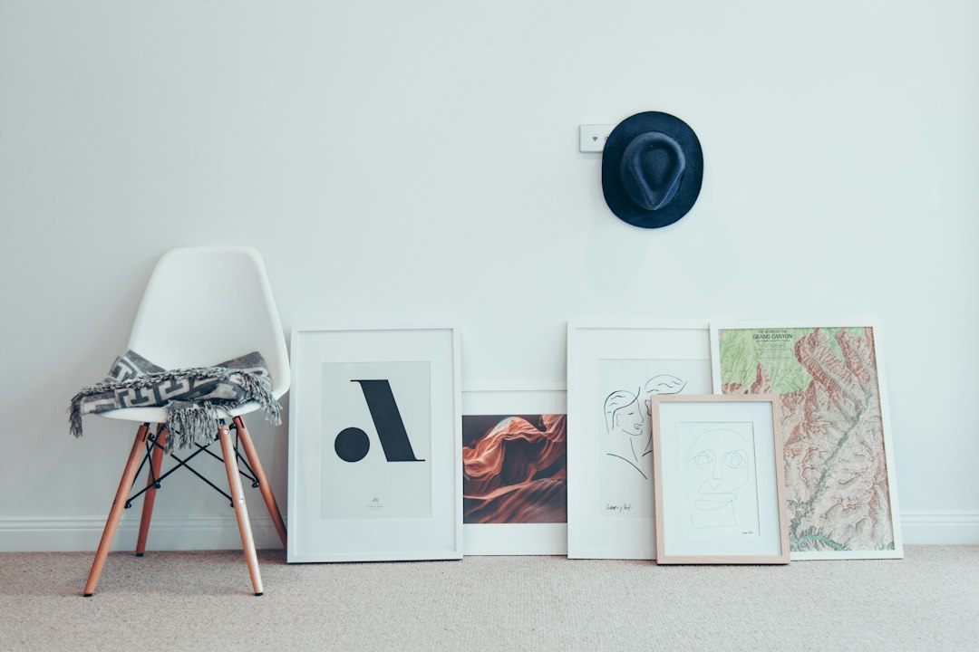
Color is one of the most powerful unifying elements. You might choose prints that all feature a pop of the same accent color, even if the subjects vary widely. Or you could limit your palette to warm tones, cool tones, or a monochromatic scheme. This doesn’t mean every piece needs to be identical in hue – subtle variations keep things interesting – but having a color story helps the eye move comfortably across the wall.
Subject matter offers another approach. A collection focused on nature might include landscapes, close-up florals, and wildlife photography. Abstract art can be grouped by style – geometric shapes, organic forms, or expressive brushwork. The key is deciding on your thread before you start shopping. It keeps you from impulse purchases that might look great individually but don’t serve the overall vision.
Embracing Variety Within Your Theme
Once you have your unifying element, the next step is building in enough variety to keep the wall engaging. This is where mixing frame styles, sizes, and orientations comes into play. A wall of identical frames in a perfect grid can look striking in the right space, but for most homes, a more dynamic arrangement feels warmer and more personal.
Size variation creates natural focal points and prevents monotony. Plan to include at least one or two larger pieces that anchor the arrangement, then fill in with medium and smaller prints. The largest piece often goes in the center or slightly off-center, with smaller works radiating outward. This creates a visual hierarchy that guides the viewer’s eye and makes the composition feel balanced even when it’s asymmetrical.
Orientation matters too. Mixing horizontal, vertical, and square formats adds rhythm and movement. A series of vertical portraits might be punctuated by a single horizontal landscape, or vice versa. This variety also helps you work with the proportions of your wall space – a tall, narrow area might call for more vertical pieces, while a wide expanse over a sofa benefits from horizontal anchor prints.
Frame choices deserve thought as well. You can create cohesion by using all wood frames in different finishes, or mix wood with metal for an eclectic feel. Some people prefer uniform matting to tie disparate pieces together, while others vary mat colors to complement each individual print. There’s no single right answer, but consistency in one element – whether that’s frame width, mat style, or finish – helps prevent the wall from feeling chaotic.
Art washes away from the soul the dust of everyday life.
– Pablo Picasso
Planning Before You Hang
The arrangement phase separates gallery walls that sing from those that fall flat. Before you put a single nail in the wall, lay out your prints on the floor. This simple step saves enormous frustration and lets you experiment freely with different configurations. You can shift pieces around, swap positions, and step back to see how the composition works without committing to holes in your wall.
Start with your largest piece as an anchor. Gallery wall layouts often begin with the biggest print positioned where you want the visual center to fall. Then build outward, placing medium and smaller pieces around it. Try to balance visual weight – if you have a dark, heavy print on one side, counter it with something of similar presence on the other, even if the sizes differ.
Spacing consistency makes a huge difference in the finished look. Most designers recommend maintaining 2 to 4 inches between frames throughout the arrangement. Measure and mark this distance as you lay out your floor plan, and carry those measurements to the wall. Uneven spacing can make an otherwise strong selection of prints look amateurish, while consistent gaps create that polished, gallery-quality appearance.
Consider the negative space too – the wall showing between and around your frames. This breathing room is just as important as the prints themselves. If your pieces are too close together, the wall can feel crowded. Too far apart, and they lose connection with each other. Finding that sweet spot depends on your frames and subject matter, but the floor layout lets you see and adjust until it feels right.
Practical Considerations for Print Selection
Beyond aesthetics, some practical factors influence which prints work best for a gallery wall. Print quality matters more when pieces are grouped together – inconsistent resolution or printing methods become obvious when you’re comparing multiple images side by side. If you’re mixing professional prints with personal photos, consider having everything printed by the same service to ensure color and paper consistency.
Scale your subject matter to your frame sizes. A detailed botanical illustration might get lost in a tiny frame, while a simple, bold graphic could look oversized if blown up too large. Think about viewing distance as well. A gallery wall above a desk will be seen up close, so intricate details work well. A stairway wall viewed from across the room benefits from bolder, more graphic images.
Lighting affects how your prints appear. Natural light can wash out certain colors or create glare on glass, while warm artificial light shifts color temperatures. If possible, hold your print selections up in the actual spot where they’ll hang and look at them at different times of day. This helps you avoid surprises once everything is up.
Budget plays a role for most of us. You don’t need to fill an entire wall at once. Many people build their gallery walls over time, starting with a few key pieces and adding to the collection as they find prints that fit. This organic approach can actually result in a more interesting mix than buying everything in a single shopping session. Selecting art thoughtfully over time allows your wall to evolve with your tastes and experiences.
Last Thoughts
Creating a gallery wall is one of those home projects that feels daunting until you break it into manageable steps. Choosing prints becomes much easier when you start with a clear theme or unifying element, then layer in variety through size, orientation, and frame style. The floor layout stage gives you freedom to experiment without commitment, and maintaining consistent spacing elevates the entire arrangement.
What makes gallery walls so satisfying is that they’re never truly finished. You can swap out seasonal prints, add new pieces as your collection grows, or refresh the entire wall when your style evolves. The prints you choose today tell the story of who you are right now – your interests, your memories, the colors and subjects that speak to you. There’s something deeply personal about curating that collection, and something welcoming about sharing it with everyone who enters your home. The wall becomes a conversation starter, a source of daily inspiration, and a reflection of the life you’re building within those walls.
Your Questions Answered
How many prints do I need for a gallery wall?
There’s no magic number – it depends entirely on your wall size and the dimensions of your frames. A small wall might look perfect with three to five prints, while a large expanse could hold a dozen or more. Start by measuring your wall space and sketching out rough arrangements on paper. Most gallery walls feel balanced with an odd number of pieces, but symmetrical grids work beautifully with even numbers. Consider visual weight rather than pure quantity – a few large statement pieces can fill space just as effectively as many smaller ones.
Should all my frames match?
Matching frames create a clean, cohesive look, but mixing styles often adds more personality and interest. If you choose to mix, keep one element consistent – perhaps all wood frames in varying finishes, or different frame styles united by the same mat color or frame width. The key is intentional variety rather than random mismatch. Consistent spacing between frames helps tie together even diverse frame styles, making the overall arrangement feel purposeful rather than chaotic.
What size should the largest print be?
Your largest print should feel substantial enough to anchor the arrangement without overwhelming the other pieces. For most gallery walls, this means something in the 16×20 inch to 24×36 inch range, though the ideal size depends on your total wall space. A good rule of thumb is that your anchor piece should take up about one-fifth to one-quarter of the total gallery wall area. This gives it presence without making everything else feel like an afterthought.
Can I mix color and black-and-white prints?
Absolutely, and this combination often creates dynamic, sophisticated gallery walls. The trick is balancing the mix so neither color nor black-and-white dominates completely unless that’s your intention. You might cluster the black-and-white prints in one area and color in another, or alternate them throughout for rhythm. Black-and-white images tend to recede visually, while bright colors pop forward, so use this to your advantage when creating depth and focal points in your arrangement.
How do I choose prints for a long hallway?
Hallways present unique opportunities because viewers experience them sequentially rather than all at once. You can create a narrative thread that unfolds as someone walks down the hall – a travel series from a memorable trip, family photos in chronological order, or a color gradient that shifts from one end to the other. Alternatively, treat the hallway as several smaller gallery walls with distinct themes, separated by doorways or architectural features. Keep spacing consistent throughout, and consider hanging prints at a slightly lower height than in other rooms since people are moving past them rather than sitting and viewing.